What your clients see: the pages you send
Most of Florio is the workspace you live in. This module is the other side: the handful of pages your clients open from a link you send them. A proposal to review and approve. A time to book. An order to sign off. You never log into these pages, but you are asked about them all the time, so here is exactly what your client sees.
Two things are true of every page here:
- It carries your brand, not ours. Your studio name sits at the top, your accent color runs through the buttons, and the only mention of Florio is a small “Powered by Florio” line at the bottom. To your client, it reads as your website.
- There is no login and no app. Each page opens straight from its link, works on a phone, and shows only what that one client needs to do. Nothing else is reachable from it.
Because your clients read these pages and you don’t, this is also the page to send a new team member, or to read yourself before a call, when someone asks “so what will they actually get?”
The proposal your client reviews
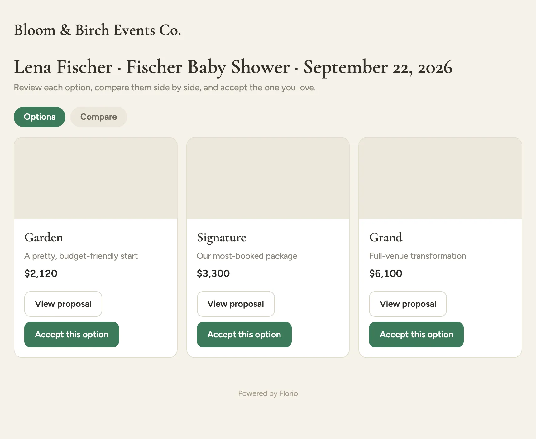
When you send a proposal with more than one option, the link opens a chooser: your studio name, the client and event across the top, and a card for each option. Each card shows the option’s name, a short label, and its price, with View proposal to read the full PDF and Accept this option to approve it. The Options and Compare tabs switch between the cards and the side-by-side view below.
 Screenshot from a demo workspace; data illustrative.
If you send a single proposal instead of a set of options, the client skips the chooser and lands directly on the one proposal to read and approve.
Comparing the options
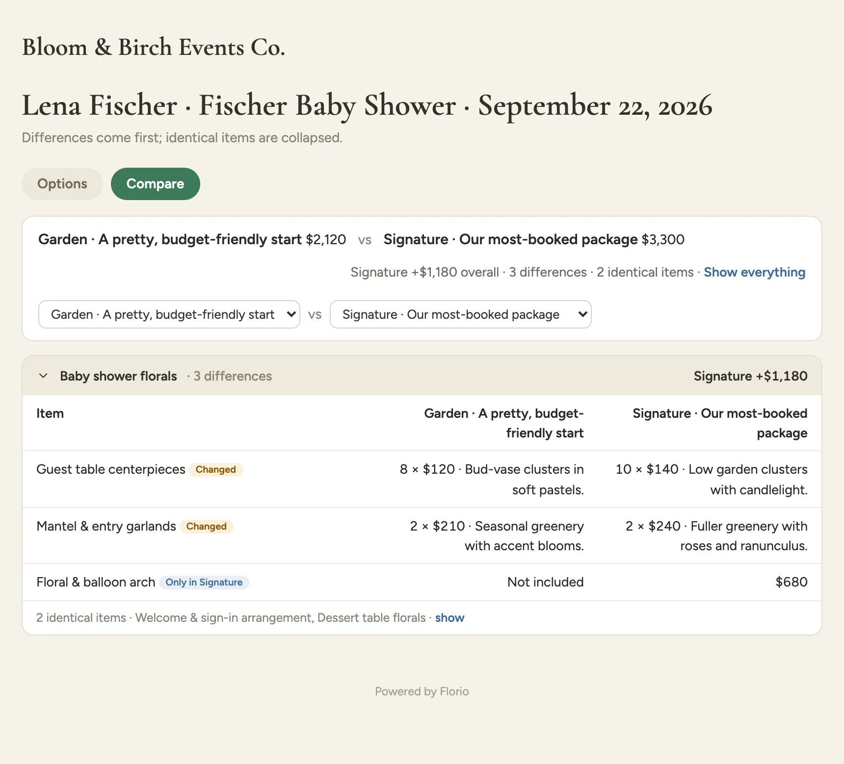
The Compare tab puts any two options next to each other so the client can decide without scrolling back and forth. Differences come first: a line whose quantity or price moved is tagged Changed, and a line that exists in only one option is tagged with which one has it. Lines that are the same in both collapse into a single row that says how many are identical, with a show link to expand them. Each section, and the page overall, labels the price gap with the option that invests more, so “the fuller one costs $1,180 more” is right there.
 Screenshot from a demo workspace; data illustrative.
Approving a proposal
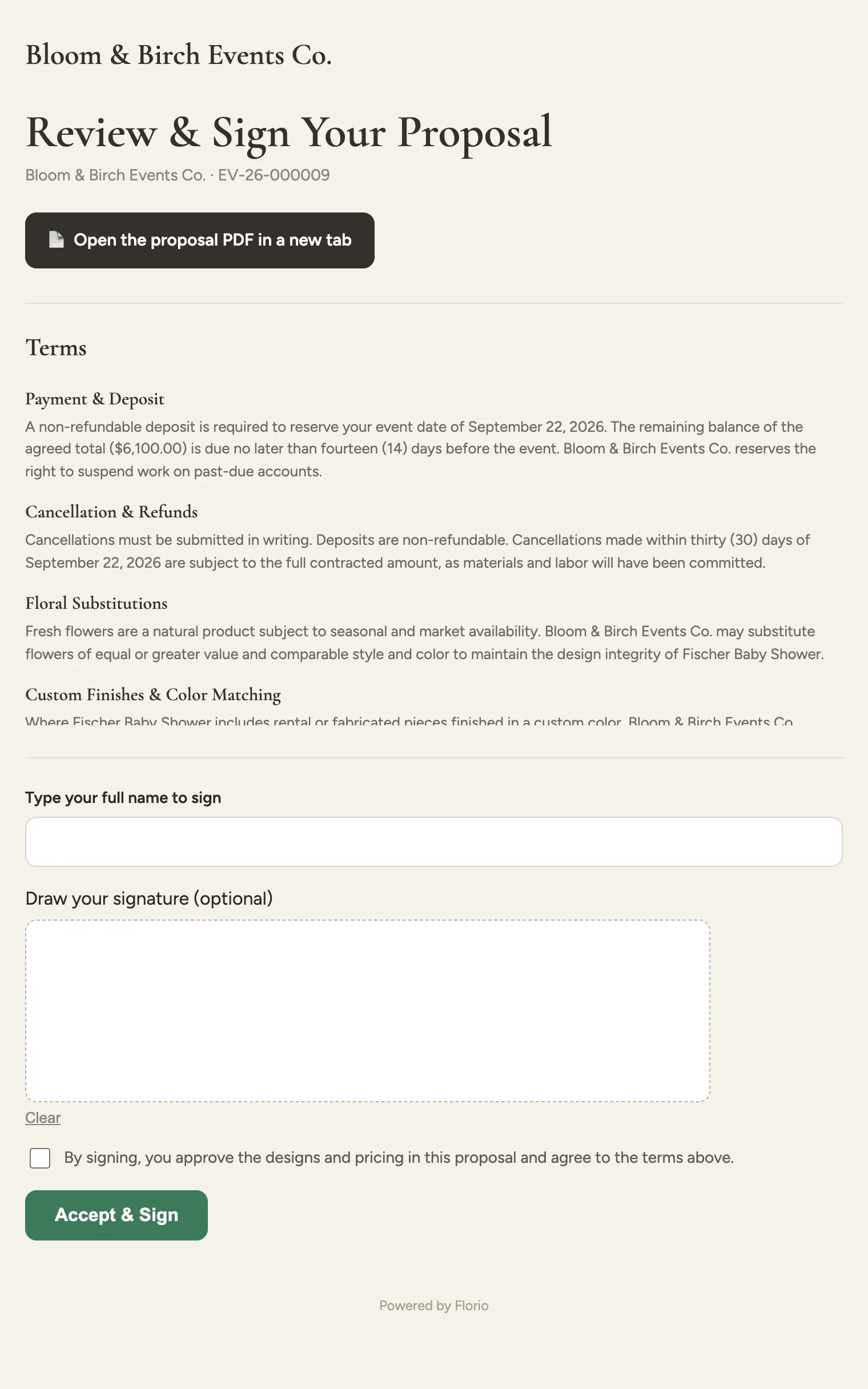
Accepting an option opens the signing page. It leads with Open the proposal PDF in a new tab so the client can read the whole thing, then lays out your terms, and ends with the signature. The client fills in Type your full name to sign, optionally draws a signature in Draw your signature (optional), checks the agreement box, and clicks Accept & Sign. The moment they do, the proposal is approved, your team is notified, and the accepted option locks in.
 Screenshot from a demo workspace; data illustrative.
The booking page
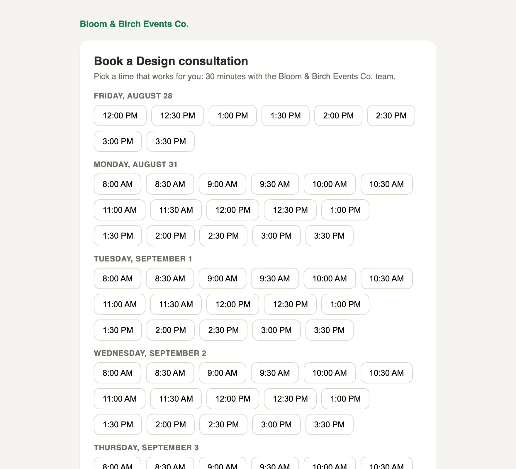
A booking link opens a page where the client picks a time from your live availability, grouped by day and shown in their own timezone. They choose a slot, add their name and email, and click Confirm booking. That books the meeting on the right person’s calendar, sends both sides a confirmation, and, for a video consult, attaches the meeting link.
 Screenshot from a demo workspace; data illustrative.
Managing an appointment
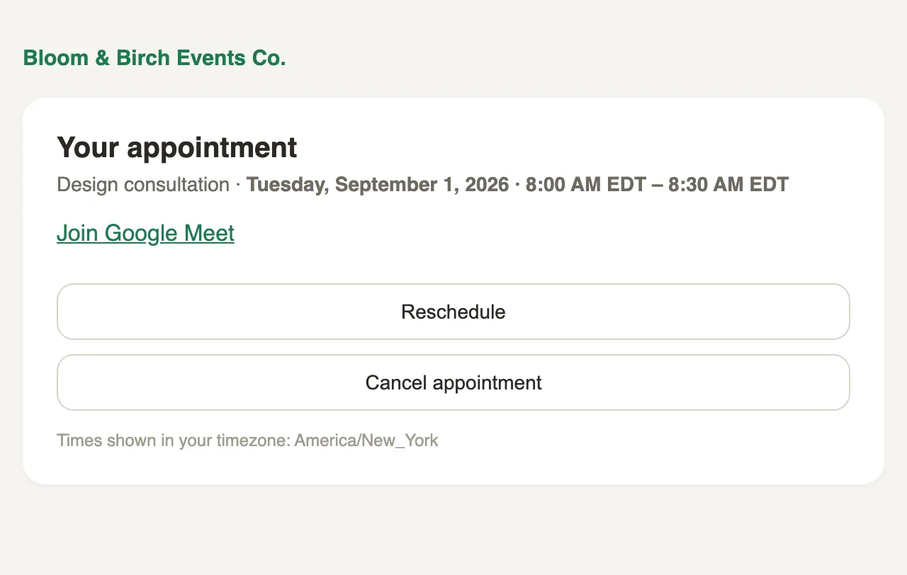
The confirmation email carries a manage link. It opens a page showing the appointment, a Join Google Meet link for a video consult, and two buttons: Reschedule to pick a new time from the same person’s availability, and Cancel appointment. Up to your cutoff, the client handles both themselves and everyone is notified; inside the cutoff, the page asks them to call you instead.
 Screenshot from a demo workspace; data illustrative.
Approving an order
Orders have their own version of the proposal flow: a Review & approve your order page where the client checks the line items and total, approves, and, when you have turned it on, pays. It is documented with the operator side in Send an order for client sign-off.